Over the past few months we’ve been working with QRBT and Geocel (part of Ronseal) to produce a brand new responsive website design for Geocel to showcase their huge range of building and DIY products.
Objective
To create a modern, responsive website for Geocell to bring the brand up-to-date and allow users to view all of Geocells products.
Goals
To allow users to browse and search all Geocells products and allow merchants to login to see merchant specific offers and product information.
Solution
The website was built using Expression Engine with additional modules to handle the complex structure and layout of the products and categories. Products needed to be shown under different top level headings and in multiple categories to enable the user to quickly find products by brand, usage or product name.
Every product in the range has a huge amount of additional information that the user can access but this information is mainly used by building trade professionals. kc web design kent built a user friendly front end system that was easy for the user to find and download this extra information and an intelligent admin system for Geocel to manage their products quickly and easily.
More and more trades-people are now using mobile devices and the building trade in general in the UK is amazingly quick at taking up mobile technologies so the new website had to be responsive and offer an optimum experience on all mobiles and tablets.
Merchant areas, stockists maps and other features will be added over the coming weeks as the website grows.
Visit website
For a long time now I’ve been using Billings here at kc web design Kent for dealing with out invoicing and time tracking. I like Billings, it works well, has good invoice template customisation and is simple to use but it is no longer getting updated. Marketcircle have chosen to move a perfectly good single payment OSX app over to a monthly subscription fee so for an app I bought for £30 over 4 years ago I now would have to pay £10 per month for not much more benefit. So, time to look at some other options.
A while ago I had some dealing with Jan Lukacs at the company that make Paymo about another app they created called Viewflux (which is also a very good app for showing creative web designs to clients to get feedback) and remembered that Paymo looked good. The beta of version 3 is free to use for 100 days so I talked to Jan and got an invite.
Paymo is an online invoicing and time tracking app that is very simple to use and has a clean, easy on the eye user interface. iPhone and iPad apps are available as well for those on the move but the web app should suite most users. Its very easy to set up and start using and provides all the basics you need to create and manage projects and tasks, create invoices and estimates and track time. The project management side of things is very good and allows you to set tasks and milestones and add times against them so you can see what the total time allocated is and what actual time you’ve spent if you use the time tracker against that task.
Customising invoices was a big selling point for me in Billings because as a designer I like everything that comes from kc web design kent to look good and that includes the simple things like invoices. Paymo doesn’t really give you much customisation of the invoice template but the one that is provided isn’t bad at all. It might be nice if we had the ability to edit a custom style sheet to make changes to the invoice template and allow a bit more customisation.
On first impressions I like Paymo, time will tell how good it is and I’ll be interested to see what changes in the beta. Once I have a few projects in there and some billed invoices then the dashboard and reporting should become more useful so I’ll do an updated review in a few months time.
For a great full review of the newest version of Paymo see Lewis Parrotts Paymo review.
As web designers and developers we all do. We do it all the time here at kc web design kent. We spend weeks crafting a website design, building and coding the templates, adding content and tweaking for all the browsers and just before it goes live we add a link back to our web design sites in the footer. We’re proud of the website designs we create and we want everyone to know who designed and built that website. Its also good for SEO…isn’t it?
Are a web designers footer links good for SEO
YES! And no. Ever since I can remember web designers have been adding footer links back to their websites and for as long as I can remember it worked. It was a great way of getting quality back links and driving business back to your websites but things change. Most importantly, Google has changed. Over the last few years Google has changed and adapted the way organic search listings are ranked and so old techniques we’ve been using for years have suddenly stopped working. The rate a which SEO has changed over the last 18 months is phenomenal and keeping up with all the new changes is a job of its own. It’s why a lot of web design companies work with specialist SEO companies like we do here at kc web design kent.
One thing that has changed over the last few years is how Google deals with site wide links. It seems that site wide links now get a thumbs down as Google classes them as un-natural. Its common sense when you think about it. You design a website for a restaurant and stick a link to a web design site at the bottom of every single page. To Google that looks unnatural and they presume its someone trying to side step their system.
What can be done?
You can have your web design link in the footer but just have it on the homepage. Or have a do-follow link on the homepage and no-follow links on the internal pages. If you’re using WordPress its easy to use the if_homepage or if_frontpage variables to put an if statement around a link.
We tried a few test here at kc web design kent and changing our footer text on a few large commerce sites had a really positive impact. We jumped from page 5 to page 3 almost over night.
At kc web design kent we’ve been working with Fujitsu UK and Fujitsu Global on a number of exciting projects for a while now. The latest project for Fujitsu UK is a complete redesign of their UK blog. Last year we created a brand new WordPress blog for Fujitsu UK that was quietly launched and gradually built up over the coming months. After the success of the first 12 months and a massive increase in readership it was time to revamp the website and create a brand new responsive design.
kc web design kent worked very closely with a great team at Fujitsu UK to design and build a new blog website that would enable a large amount of written content to be viewable on a multitude of different devices. A unique look and feel was created by kc web design kent to differentiate the blog from other Fujitsu websites while keeping within the strict brand guidelines. Unique identifiers were created for each of the 5 main sections that would allow users to easily scan different stories on the site. The layout was kept simple but intuitive to maximise the readability of the content and minimise distractions.
To create the responsive website design kc web design kent utilised the fantastic Twitter Bootstrap responsive framework to build the WordPress theme templates and create a truly universal viewing experience on all devices. The in-house design team at kc web design kent used a combination of apps and technologies to build the initial templates including Twitter Bootstrap, Coda 2, LESS, LiveReload, Hammer and Ghostlab for testing on our suite of different devices. Using this suite of Mac products enables us to design responsive websites swiftly while being able to view as we build on lots of different devices.
Other projects that kc web design kent have been working on with Fujitsu include social media branding, contact and business lead user flow and processes, email newsletter design and more.
Visit website
I came across Dash – The API Documentation Browser and Code Snippet Manager for OSX – in a tweet the other day and thought it sounded interesting and maybe useful at kc web design kent. At kc web design we work a lot with html, css, WordPress, Expression Engine and all sorts of other code bases like PHP, Jquery, etc at kc web design kent and when forgetting syntax or functions it’s a case of using Google or Stack Overflow to refresh your memory. When I’m using Coda I sometimes use the books to lookup syntax while I’m coding but they don’t always cover everything you need and don’t have the full documentation for things such as WordPress or Expression Engine which we use a lot at kc web design kent.
Dash is a desktop app for the Mac that gives you access to a searchable, offline selection of over 80 API’s. You can download just the ones you need, search for specific words in all documentation and even store your own code snippets and make your own searchable documents. It sits nicely in the menu bar at the top and hides away until you need it. One really nice feature in Dash is when you search it also searches google and Stack Overflow so if it doesn’t find an answer for you in the API documentation then you have the option to see whats there as well. After testing Dash while doing a bit of WordPress dev the other day at kc web design kent I found it extremely useful. It doesn’t always give you what you need when searching but it does make it very easy to look through the documentation without having to search through online codecs and docs.
I’m not sure how useful the snippet manager will be at kc web design – I tend to store all my code snippets directly in Coda so they’re right where I need them – but it could be good for storing large chunks of code for templates and themes.
And, as I’m writing this I’ve just had a notification window pop-up to tell me the WordPress 3.7.1 docs have been updated so it looks like it updates all docs in the background. Bonus!
As well as the website design work I do at kc web design kent I also work with a number of other large companies as a website design consultant and project designer. One recent website design project I was involved with was on a series of projects for the CIOB (Chartered Institute of Building). As well as designing banners and other promotional material I was asked to re-design the Carbon Action 2050 website with our partner company – Hydrant.
Hydrant were the project leaders, I designed the website and it was built by CIOB dev team (i01). Not quite the unified team I’m used to working in and not being able to have a hand in the development of the site was very difficult (and ultimately I think it effected the final product) but all in all it was a great website design project to work on.
The new Carbon Action 2050 website is an important website for the construction industry pushing the boundaries of what can be done to make the building industry more eco-friendly…
The CIOB Carbon Action 2050 toolkit is an action plan of simple, practical steps that can be taken by the Institute, its members and the wider construction industry to reduce carbon emissions from the built environment. Now. Anywhere in the world.
The Carbon Action 2050 website was designed to make the information more engaging and create a sense of value to the information. Reducing carbon emissions in the construction industry is an important mission and so the website design needed to be in keeping with the CIOB global styles but also offer a unique identity of its own while making the wealth of information easy to find and read.
The website is responsive and works on all mobile devices although the exact implementation of this wasn’t carried out by Hydrant or myself.
In our previous article – kc web design kent – Why I hate iOS7 – I spoke about the reasons why I didn’t like iOS7. Since that article there have been many more reasons not to like iOS7 and its many inconsistencies. Text padding and spacing still really plagues the OS in some very odd places such as when the wi-fi icon disappears and is replaced with the GPRS text. On my O2-UK network the GPRS text is almost overlapping the time. Buttons that would normally have had a border to even them out symmetrically now look very strange and misaligned. In the Messages app you sometimes get the Messages and Contact buttons (Can we still call them buttons? Aren’t they are now just text links?) on either side with a long phone number in the middle with no proper spacing between them so they all seem to merge into one long line of text. At least buttons with edges would have had a visible divider between each bit of text…anyway, before I get on to another stream of iOS7 bashing…
Why I LOVE iOS 7
Yes, I know it seems a bit strange to have one article called “kc web design kent – Why I hate iOS7” and another one called “kc web design kent – Why I LOVE iOS 7” but that’s just what iOS7 seems to be doing to people. Most, if not all, of my iOS7 hates come from a design and UI perspective. Because I am a web designer and UI designer I am being very over critical (Something Apple should have been as well!) on the design side but as with so many Apple products, design IS very important.
After using iOS7 for a few weeks at kc web design kent I am beginning to really like it (design gripes aside) and it’s the overall feel that’s really starting to grab me. In general use iOS7 on my iPhone 4s feels pretty quick and some of the new interactions are very, very nice. The OS feels sharp and quick but fluid and easy to whizz around. Everything feels in the right place (if not looking quite right) and there’s a fluidity and continuity to it that iOS6 didn’t have. Going back to iOS6 now feels a little clunky, like everything is a bit too solid and boxed. There is a lot I miss from the old OS but iOS7 has a lot to like. It’s not there yet though and I’d like to see some of the design and UI niggles fixed in the next big release, but overall, yes, I do LOVE iOS7!
That just leaves one more question though…what is iOS7 like on the new iPhone 5s? Where’s my wallet…
So, Google has thrown its hat in the ring of web design tools with Google Web Designer. There seems to be a new web design tool coming out every other day at the moment, some good, some bad, some trying to be that all encompassing tool that will do everything a web designer needs.
I’m not so sure as web designers that we need one tool that does everything. I like using Photoshop. I like coding in Coda. I like using Hammer for local dev. I like using Ghostlab for testing. I’ve tried Adobe Edge Code but it doesn’t beet Coda. I’ve tried other web design tools that claim to make responsive web design easier but they just don’t suite my workflow and hand coding practices. Web design changes so quickly these days that the ‘one tool’ that works today will be next years Fireworks. Not every web design project is the same and some will require tools that others don’t. I prefer to use a tool that lets me focus on the job in hand; Photoshop for graphics, Coda for coding, Gridstep for responsive grids, etc.
Google Web Designer
When I saw the tweet from Project Meteor about Google Web Designer I instantly took a look at the website and was instantly confused as to what the tool was claiming it could do. As the title of the tool suggests – Google Web Designer – you’d think it would be a tool for creating website designs. After downloading Google Web Designer and having a look around it became apparent that this wasn’t a ‘Web Designer’ tool at all but a way to create interactive HTML5 adverts and animations. There are some preset document types for a range of ad sizes and components that you can drag to the page to create sliders and galleries. The other side to the Google Web Designer tool is creating slick HTML5 animations and the Google Web Designer tool has a raft of 3D and other tools for creating some very good animated elements. No drag and drop components here yet but then Google Web Designer is still in early Beta.
Would I call it a web design tool? No. I’d call it a tool for creating animations and interactive ads. I really wouldn’t like to start creating a website with Google Web Designer, it’s just not the right tool for that kind of job. Maybe as the Beta grows it will become a fully fledged web design tool but at this stage its just not. It might come in handy when I need to work on some interactive (Non-flash) banners on an upcoming project so another review then might reveal its hidden charms.
It probably would have been better to call it ‘Google Web Ad Animator’.
While developing a series of websites using the great Woocommerce for WordPress the development process we’re using at kc web design kent meant we needed to make copies of existing website designs and then redevelop them into new websites. Part of the process we went through at kc web design kent was changing the design and then adding a different set of products but to do this we first have to delete the existing ones. Adding products in Woocommerce is made very easy with the CSV import suite and updating existing products using a merge CSV import but there is no easy way to delete all products, especially when there are thousands of them. A nice feature in Woocommerce would be a way to bulk delete products but until that appears in the core or until someone makes a plugin the only way to delete products on-mass is to do it directly on the database.
Working directly on the database is always a bit scary, especially if you don’t know MySQL syntax and how to write complicated queries. Because of the way Woocommerce uses posts to store product data and the fact that products can have variations and custom post types, it can make it very difficult to know where all the data is stored. Woocommerce spreads the product data across posts, terms, taxonomies, term_relationships and post meta which makes things tricky if you want to do it in a visual SQL client. The best way is to use a few SQL queries. On this recent project at kc web design kent we needed to delete a lot of products and so after a bit of searching around on Google we came up with these queries.
Before using these remember to backup your database in case anything goes wrong. You’ll also need to change the default table prefix (wp_) to whatever you have used in your database. And remember, its always good practice not to use the default wp_ prefix on any WordPress websites. The queries below also have to be run in this order.
DELETE relations.*, taxes.*, terms.*

FROM wp_term_relationships AS relations

INNER JOIN wp_term_taxonomy AS taxes

ON relations.term_taxonomy_id=taxes.term_taxonomy_id

INNER JOIN wp_terms AS terms

ON taxes.term_id=terms.term_id

WHERE object_id IN (SELECT ID FROM wp_posts WHERE post_type='product');
DELETE FROM wp_postmeta WHERE post_id IN (SELECT ID FROM wp_posts WHERE post_type = 'product');

DELETE FROM wp_posts WHERE post_type = 'product';
I hate iOS 7. There, I said it!
There’s been a lot of talk about iOS7 over the past few months and last week it finally launched. Lots of people won’t update yet but working in the web design and iOS design industry you kind of have to. So I did. To be honest I find it messy and cheap looking. The famous gradient icons just don’t seem to work in places especially on the dock with certain colours. The dock – annoyingly (why can’t we choose a colour for the dock?) – takes on an automated colour based on your wallpaper image and sometimes that colour clashes badly with the icon gradients making them blend into the background and look really nasty. On my iPhone only dark backgrounds seem to work well. Anything in a mid tone fights with the icon colours too much. And those folder icons are the same, they take on an automated colour that just doesn’t seem to work and they look a mess. With all the emphasis on nice transparent layers in iOS7 I would have thought that some transparency on the folder and dock backgrounds would have looked very nice.
Another thing that adds to the messy feel of the app screens is the padding around app names. A lot – far too many for my liking – of the app names on my iPhone touch each other. It’s as if there’s not enough padding on the grid and names are overflowing into each other. Now come on, any web designer knows that padding should be set so that grids flow nicely and text names don’t touch or overlap. On every project we do at kc web design kent its one of the THE most basic things to get right.
The icons on my phone look really inconsistent because many apps haven’t updated their icons to the new style. I guess this is only a matter of time and once developers update their icons it will feel more consistent but it shows that the new iOS7 isn’t very forgiving. Because of its very unique style anything that doesn’t use that style now looks out of place. Surely the iOS should facilitate a certain amount of freedom and not dictate what looks good. The old iOS6 seemed to deal with this a lot better and the vast array of different styled icons still looked ok on the screen.
And fonts, oh those fonts. I don’t actually mind the Helvetica Neue, it looks quite nice, but in some places the size is too small and the weight is very light. On some apps the icons at the bottom have text underneath and they’re barley readable. So many people I know that wear glasses find them unreadable. Again, this is basic design stuff and Apple should have got this right.
I know these seem minor gripes but as a web designer at kc web design kent I have to deal with and make sure these types of design rules are done right every day, and I make sure they are. Apple, with all that man power and money, could surely do the same. At kc web design kent I’m looking forward to working on our next iOS app design project so that I can play around with the new styles.
Lets hope some updates appear over the coming months that fix these teething problems. And on a brighter note, lets not forget that iOS7 is a huge update and a massive leap forward for the worlds leading mobile OS. When I think back to the first iOS it was revolutionary, but it had a lot of issues too. It took a few years and a few iOS updates for it to feel like a proper iOS and I feel iOS7 is the same. It’ll mature and grow over the next few years.
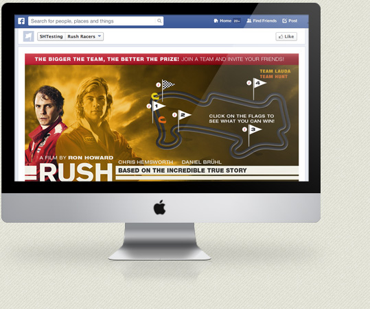
kc web design kent were asked by a leading major travel brand to help create a Facebook App competition for the up-coming launch of the new Ron Howard (A Beautiful Mind, Apollo 13) film – RUSH.
The Rushracer Facebook app was design by the in-house design team at this leading travel brand and built and coded by kc web design kent. The Facebook app was built using the Facebook app API and features some advanced SVG animations to show the stage of the competition round an F! race track. Users can vote on which team they want to win – Team Hunt or Team Lauda – and prizes are won at different stages of the game. All the standard social media mechanisms where used to promote the game through Facebook and Twitter and the competition will run throughout September.
kc web design kent worked very closely with the in-house design team and have created a compelling app targeted at a specific age range. For more information about the Facebook app and the new RUSH film please visit the app.
Visit Facebook App
WordPress has come a long way since it’s early days as a simple CMS. At kc web design kent we used to build bespoke e-commerce systems for big wholesale clothing companies that would take months to develop and integrate with internal stock management and ordering systems. These days we don’t do many bespoke e-commerce solutions but we do still create e-commerce website design here at kc web design kent. The costs involved in creating a bespoke e-commerce web design solution are high and can be prohibitive to most businesses so these days we tend to use different solutions.
There have been some very good e-commerce packages in recent years including the noes debunked Trading Eye and the very good, and still with us, Lemon Stand. At kc web design kent we’re experts in WordPress and Expression Engine and these top class content management systems can be used for e-commerce website design. Having created a number of e-commerce website design solution with both of these systems I have to say that WordPress comes top of my list.
The ease of setup and user friendly control panel makes WordPress ideal for small to medium e-commerce solutions. With the addition of the fantastic Woocommerce plugin a feature rich e-commerce website can be designed and built in a very short time and at minimal cost to the customer. The Woocommerce plugin gives website owners a rich suite of tools to deal with products and a complete order management system. Building this on top of WordPress means a whole e-commerce website can be built that our customers can have full control over including all page content, news sections and shop. Woocommerce is built by Woothemes and has a wealth of additional plugins to deal with all sorts of e-commerce features such as payment gateways, invoicing, Google product feeds, EU VAT, wish lists and anything else a modern shop needs.
Even though the combination of WordPress and Woocommerce can enable us to create fantastic e-commerce website designs, like all good e-commerce websites, it’s how that functionality gets translated into a good user experience that matters. Just grabbing a free theme and creating a shop isn’t always the right option. Making sure the buying process and user interface design is intuitive and sticks to standard design patterns is the key to creating a good online buying experience. At kc web design kent we’re experts in e-commerce website design and user interfaces and our bespoke designs will make sure your e-commerce website succeeds.
I enjoy writing CSS here at kc web design kent but sometimes in the thick of development my nice neat CSS documents can become a bit, well…messy. Most of the time I’m working alone on web design projects at kc web design kent so I always think it won’t matter too much. But then I go and open a CSS style sheet from and old web design project to make some changes and I always have to edit the “messy” bit I left in. Still, I only have myself to blame.
The other day I came across this fantastic article on github about how to write, layout, structure and use proper selectors in your CSS documents. There are quite a few of these types of articles knocking around but for some reason this one seems to strike a cord with my style of writing and thinking about CSS in web design. This article is well worth a read and a bookmark and I can see myself coming back to this again and again.
From the simple contents structure to how to indent and layout your document in a well ordered, easy to read manner with nicely formatted comments, indenting and hierarchy (cascade) for easy finding of CSS styles in a structure similar to your HTML doc it all seemed to make more sense than previous articles I’d read. As well as small web sign projects at kc web design kent I do work on other large website design projects in bit teams of people and have never rally seen a perfect way of dealing with CSS doc layout. I’m very keen to try and stop my CSS docs becoming messy on web design projects at kc web design kent, and to try and clean up team based CSS doc writing, so I’m going to try and stick to the methods in this guide for a few months and see if it makes a difference to my web design projects and those larger team based projects to.
It’s been a while since I’ve done a dribbble freebie so with a few minutes free today I decided to pull out an old logo and do another dribbble freebie for the web design community. So, kc web design kent is proud to give out another dribbble freebie – Stacked note box icons.
Eagle eyed web designers may notice and striking similarity to the logo for Noteboxapp.com. Well, it was kc web design kent that built Notebox back in 2010 and as the web app is no longer running as a service I thought the logo could be used for other things. I’ve always liked the logo we designed for it so maybe other web designers could put it to good use and use it in other web design projects. There’s probably a tonne of old designs in the kc web design kent vaults that could be used for dribbble freebies so over the next few weeks I might dig out some more to share with the web design community. And while working on lots of front end coding it’s nice to throw a little bit of design into the middle to break things up a bit!
If any website designers out there do use this dribbble freebie for a design project please leave me a comment on dribbble and let me know where it’s been used. It’s always nice to see how other designers use little design snippets like this and it’s fun seeing how it ends up on those “40 best dribbble freebie” type blog posts!
Download the Dribbble freebie
It’s been everywhere this week. Apples’ new iOS 7 design has sparked much discussion in the web design world and the interwebs are rife with comments, critique, moans and admiration for the new iOS design. Designing iOS apps as we do here at kc web design kent means we have a vested interest in what happens with Apple products. A huge redesign of the core interface means a lot of changes for app designers in the future so its something that everyone in the industry is watching.
The new design is a radical step forward away from the current iOS design and pretty much everything about iOS7 is different from whats come before. Over the past few years there have been lots of moans and grumbles from the design community about the over-use of skeuomorphic design elements in iOS and OSX. Far too much leather, linen and stitching. So it goes as no surprise that when Jony Ive took over the team for iOS UI design people thought things would change. And so they have! iOS 7 is completely different.
On the whole I think the look and feel of the new iOS is good. It has given it a new lease of life which was badly needed as the original feel was becoming dated. But, even though its still in beta there are things that are still very wrong from a design perspective. The true beauty of a design is how it interacts so until we can get our hands on a useable device it’s very hard to give a proper opinion and I’m sure it will be gorgeous to use once it’s on the phone. We shouldn’t be judging the new iOS purely on the way it looks but that is a big part of the new design. I think it’s getting such a bad wrap from the design community because it’s such a radical change but things do change and they have to change to stay fresh and exciting and I think iOS7 is definitely fresh and exciting. It still has fundamental flaws though.
The art of creating wonderfully complex iOS icons has turned into it’s own art form over the last few years but Apple have changed that now with the new look flat app icons. The new look app icons are very flat, with no gloss or shadow and some of the default app icons have horrendously bad gradients. I’d like to see them with far more subtle gradients or no gradients at all to be honest. The other problem with the new iOS design is the font. It looks like Helvetica Neue Light which kind of works but doesn’t offer up its own unique style to the user interface. Surely Apple could create their own unique iOS7 font that would give it a unique identity and really shout ‘this is iOS7!’.
Overall I do like it. Apps will change and adapt to the new UI design and here at kc web design kent we’ll be looking differently at any new apps we design now for iOS. If I designed an app now I’d use some of the new UI design but incorporate some of the old style as well. Hopefully it will evolve over the coming months and by Autumn Apple will have ironed out these inconsistencies and iOS7 will be a lovely new UI. Lets hope Apple listen and adapt and keep iOS at the forefront of mobile devices.
kc web design kent are absolutely delighted to be working as web design consultants for Fujitsu.com, the global website of the electronics giant. After a successful launch of the new UK blog website kc web design kent were asked to come in at a high level to consult on web design issues on the global Fujitsu.com website.
kc web design kent will be working very closely with Progress SEO to ensure any design and content related changes to the Fujitsu.com website are made based on factual design and SEO data. All web design and layout changes to the website will be consulted over and important design decisions validated, tested and checked.
Asked to become web design consultants at this level is a huge responsibility and one that we take very seriously here at kc web design kent. Working alongside Progress SEO is always a pleasure and we’ll be using this partnership to improve and re-structure specific sections of the Fujitsu.com website starting with the sustainability section and then moving through other parts of the Fujitsu.com website when content or web design structure needs changing.
The Fujitsu.com website is huge and encompasses over 100,000 individual pages so changing anything on a website this large has to be thought out very carefully. The layout, design and content all have an impact on the user journey and how effective the information is digested so even minor changes at this level can have a massive impact, especially on a website this large. The importance of good page structure, content hierarchy, user flow, information retention and visual cues and call-to-actions cannot be underestimated and it is our job at kc web design kent to make sure any changes on the Fujitsu.com website are changes that will improve the experience for the user and improve lead generation and SEO rankings for Fujitsu.com.
kc web design kent are proud to announce the launch of a large web app design project for ThermaSolutions. Back in early 2012 kc web design kent were contacted by ThermaSolutions and asked to produce an iOS app for the building and construction industry. After many months of hard work on the iOS app the project was shelved due to various reasons but kc web design kent worked hard with ThermaSolutions to bring something to market that far exceeded the original project scope. ThermaSolutions continued to evolve over the coming months and has now been launched as a web app subscription service.
kc web design kent designed, built and crafted the web app and the new website is now live. The ThermaSolutions web app was built using Expression Engine with the Membrr subscription module to handle the payments and subscriptions. The web app design is fully responsive to enable it to work on all mobile devices as well as desktop browsers and utilises advanced HTML5 and Javascript technology to allow the web apps to work in offline situations for construction staff out in the field with little or no connectivity. All parts of the web app work independently as stand alone apps that can be saved to the iOS device home screen and work like normal iOS apps. This enables the user to have access to a remote web app thats stores their reports but still be able to use the reporting tools and calculators when offline.
An advanced subscription system and seamless payments were integrated into the web app to provide easy access and signup flows for the user. Over the next few weeks kc web design kent will also be producing a hybrid iOS app that will allow users to download selected parts of the web app directly from the Apple app store.
Visit Website
kc web design kent were approached by Callagenix back in October 2012 to redesign their current website. Callagenix are a supplier of telecommunication services to businesses and they need to redesign their slightly dated and content heavy website and bring it up to date with a responsive website design. The challenge was to allow the user easy access to the wealth of information on the website but at the same time making it easy for the user to quickly get to information about products and services and allow them to enquire of buy online.
The new website design created by kc web design kent was built on the fantastic Expression Engine and Zurb Foundation with advanced functionality added with bespoke PHP. Plugins were used to enhance the website features and make sure previous blogspot posts could be easily imported. Advanced article tagging for the news section, offsite backups, import and export routines, social media integration and dynamic categories and call to actions were all integrated using Expression Engine. A lot of hard work has been put in to making sure old content was rewritten and external blog posts were integrated into the new website. SEO was a major concern after failings with the previous website and SEO company so content structure was redesigned and advanced SEO integrated into Expression Engine to allow Callagenix staff to produce new pages and articles that would maintain good SEO presence and help improve page rank in organic searches.
The responsive website produced by kc web design kent allows the website to be viewable on all mobile and tablet devices which is very important for a website in a technology based market place. With mobile devices rapidly becoming a large percentage of browsing users its imperative that all modern website designs are tailored to these devices.
After 5 months hard work at kc web design kent the new Callagenix website design went live this week.
Visit Website
We all know we have to do, but finding time to write content for SEO can feel like a chore especially when you’re working all hours on client web design work. Keeping on top of SEO writing and keeping your website full of fresh new relevant content is hard work and something that has to be maintained. We’ve been so busy here at kc web design kent for the last few months that I’ve let the content writing slip a little. I was writing 2/3 articles per week which really helped with the ‘web design kent‘ keywords and meant that kc web design kent were on page 3 for ‘web design kent‘, page 1 for ‘freelance web designer kent‘ and a few others. Unfortunately, after a month or so of not writing many articles and letting things slip a little we have now dropped down to page 6 for ‘web design kent’! Thats a few pages down is as many weeks!
For any online business, staying up in the organic search results is extremely important and this little (unscheduled) experiment shows that you HAVE to keep up with the content writing for your listing to stay consistant. At kc web design kent we know have a hard slog in front of us to get back up to page 3 for ‘web design kent’ and our other search terms. Sometimes, when you’re working hard it difficult to think of things to write about. Checking news websites and setting up Google alerts on related topics can help find inspiration, then it’s just a case of finding the time. Setting aside 15 minutes and writing a new article first thing in the morning is the best way. It gets it done before any other distractions take over. If you find inspiration hits then don’t forget to write as many articles as you can, you can always save them or schedule them for publishing later when you’re a bit stuck for time.
So, the lesson learnt is to stick with it, keep on writing regular articles and stay up in the search listings.
Its been reported quite widely in the media this week that WordPress has been under attack. WordPress powers millions of websites so an attack like this is no small thing. Millions and millions of sites will have been hacked and the brute force attached looks like it was aimed at weak admin usernames and passwords. Probably an attempt to gain access to more servers for a bigger attack, the hackers targeted WordPress websites with weak passwords that were still using the default admin login. Even WordPress websites with different usernames but weak password could still have been compromised. kc web design specialise in WordPress website design in kent and all over the UK and we’ve seen a lot of damage done by this attack.
Whenever we build a WordPress website design here at kc web design kent we take security very seriously. The first thing we do is to setup WordPress on the server then lock it down, harden it and add extra security features. We try and protect it from all of the most well known attacks as well as making sure password policies are tight. There are a few useful plugins we use on every WordPress website design we do as well as using some other tricks to secure config files and other important areas of the WordPress system. There are loads of tutorials around that explain the best practices when securing WordPress so I won’t bore you with a huge article on that. The plugins that we always use and are well worth taking a look at are: Block Bad Queries, Wordfence, Secure WordPress by WebsiteDefender and WordPress Backup 2 Dropbox because if anything does happen to your website you want to get it back up quickly right?
Security on any system is a serious issues so don’t let anyone build you a WordPress website without making sure its secure. kc web design specialise in WordPress website design in kent and all over the UK so talk to use before you decide on creating a WordPress website. We can make sure its safe.
Last week my iMac screen brightness started flickering. At first I thought it was my eyes playing tricks in the sun coming through the studio windows but after a few days I noticed a defined change in brightness in the lower left part of the screen. At kc web design kent we love iMac’s because of the huge amount of screen space. Combined with a second 24″ monitor and you have an almost perfect working environment for web design and iOS design work and coding. iMacs have been a part of our equipment here at kc web design for the last 5 years and this particular iMac was bought in 2009 so only a few years old.
I’ve used Apple computers for designing every since college over 20 years ago and have never really had any issues. The Macs we use at kc web design kent are used every day, every week all year and never really miss a beat. So, I now have an annoying flicker in the left part of the iMac screen and its getting pretty annoying. After a few quick Googles I came across quite a few mentions of this particular issue with 2009 iMacs so it looks like a bit of a general fault. Lots of people saying its a problem with the left LED in the screen (There are 2 in these iMacs apparently) and thats its on its way out and needs replacing. Others saying its just a loose connection and that you can push the screen on the bottom left about 1-2 inches in from the left on the bottom black edge and it should stop the flickering for a while or until the connection becomes loose again. Terns out this second fix worked for me.
So, I have a loose connection on a 4 year old iMac…those new iMacs do look very nice…
kc web design kent are delighted to be working with the wonderful Yohondo on their brand new iPad app. We’ll be designing the user interface over the next few weeks to create a beautiful UI experience and craft an award winning app.
Yohondo is a new iPad app designed for teaching grade 1,2 and 3 piano in a new and intuitive way. kc web design kent will be working with the Yohondo team to take their working wireframe app and turn it into a visual exciting, beautifully design experience for all levels of users. The app is designed to help children and adults learn graded musical pieces in a new and exiting way and the user interface and overall design will reflect this.
The new Yohondo iPad app will be available later this year along with a brand new website design. A second round of beta testing will be starting soon once the new user interface design is in place so if you’re interested in becoming a beta tester head over to the Yohondo website.
At kc web design kent we specialise in iPad and iPhone user interface design and understand the complexities of designing for touch devices. We also create web apps and responsive website designs that can be used on all types of devices such as phones and tablets. If you have a project that needs a user interface or want a website that taps into the growing mobile marketplace then get in touch with kc web design kent for a chat.
After a good few hours trying to debug a web app in Mobile Safari here at kc web design kent we finally worked out that having private browsing turned on in the Safari settings was causing javascript and local storage to not work. Safari mobile seems to deal with private browsing differently to other browsers and it actually stops any kind of local storage from being set where as Chrome still allows a certain amount of storage to be accessed.
To warn users that they have private browsing on we can do a little check with javascript…
var testKey = 'qeTest', storage = window.sessionStorage;

 try {
 // Try and catch quota exceeded errors
 storage.setItem(testKey, '1');
 storage.removeItem(testKey);
 } catch (error) {
 if (error.code === DOMException.QUOTA_EXCEEDED_ERR && storage.length === 0)
 alert('Please make sure you have private browsing turned off in your Safari settings to use this website');
 else throw error;
 }
This will check whether local storage can be set and if not warn the user that they have private browsing turned on. Hopefully this will help anyone else that comes up against this problem.
To be honest, I can’t really remember my first website that well. It was over 15 years ago so specific facts feel a little fuzzy. Before I was a ’proper’ web designer (which is what I call myself now) I was a graphic designer for print and before I did that I was a photographer for a very short time and that’s what I was doing when I built my first website.
At the time I was at art college in Bournemouth and heavily involved in music. A good friend worked at the local independent record shop (back when record shops still sold records) and asked if I’d be interested in looking into a website design. As I mentioned before, exact memories are a little faded (I was at college!), but from what I can remember I knew a bit about the web but absolutely nothing about how to make a website. Still, like all good students I needed the money so agreed to look into building a website for the record shop.
Im not sure whether it was the lure of money or the access to free music and beer that drove me on, but armed with a copy of the latest web magazine and whatever other information I could get my hands on I set about learning how websites were made. My first real experience in front of a computer coding was very different to reading about it on paper. At the back of the shop was a set of stairs going down into a basement that was no bigger than a very small single bedroom. The room was full from floor to ceiling with records with a small space left for a PC. Windows 94 at its best! In this dark basement with the sound of dJ’s checking out the latest vibes (that’s it, that’s what e record shop was called – Vibe Records!) floating down from above I set about trying to construct a website.
All I really remember is battling with tables, endless nested tables just to get a logo in the right part of the screen. There was no CSS, or not that I knew off and html 1 was all I had to use. I remember swearing a lot trying to hand code complicated table layouts with rows and columns and spacer gifs. It took weeks of sweat and tears and checking in Netscape navigator (go and check it out kids, it’s the granddaddy of all modern browsers) to create a very basic website but I was very proud and the shop was very pleased. 12 months later the shop had gone and so had my their website.
What would I do differently? Well, pretty much everything actually. The web is a totally different place these days and the web design industry has gone through many changes in the last 15 years. I saw the death and rebirth of the web design industry and how it’s come alive in the last few years with a fantastic community. It’s like no other industry I know. I’d do everything different today if I built that website again but then I’d probably do it different if I built it again in 12 months time. The web design industry moves that fast. That’s why working in this industry is so exciting and why you should always be learning and why you should treat every website like its your first.
This article is an entry about website design for the 123-reg My 1st Website competition . You can see more info here…http://www.123-reg.co.uk/first-website-competition.shtml
Working in an online business like kc web design kent means that almost every working day I’m logging in and out of services or apps. Every day my whole online life is governed by passwords for email accounts, online web design services, social media, to-do lists and more. It feels like every month or so now some online service gets hacked and we all have to change our passwords again. In the last few months we’ve had Dropbox, Twitter and now Evernote is the latest victim.
On Evernotes website they apologise “for the annoyance” and say that data is safe although passwords were breached. I suppose thats all it has become now, an annoyance. Not the ‘end of the world’ catastrophe we all used to think it was when something got hacked but just an inconvenience and one that we can fix just by changing a password.
The problem with all this is when your daily online life is so full of passwords that you start using the same ones for everything. I know I’ve done this in the past. But with the ease that hackers are gaining entry to major online services its time to be a little more security conscious and make sure you don’t use the same passwords for multiple services. At kc web design kent we use password systems such as 1Password to help remember all our online log ins and to stop the need for having to remember hundreds of passwords. Other systems are available but as we use Macs and iPhones here at kc web design kent then a native app that works on all our devices is our best option.
So don’t take the chance, make sure your passwords are secure and not the same on multiple accounts and use a tool to remember them. This way it stays and annoyance and not a catastrophe when you loose data or find your personal details have been used for something else.
I thought we’d start doing a little Friday round-up here at kc web design kent of interesting things that we’ve come across during the week. So for our first ‘Friday round-up’ we’re going to have a look at all sorts of interesting web design and development related goodies and just plain cool stuff that we’ve come across over the last week.
Zurb Foundation 4
The latest version of the best (in our opinion, although Bootstrap is coming a very, very close second now) responsive html5/css3 framework is out. kc web design kent were invited to the launch party in Mountain View but we decided it was a little too far to travel from Kent!
The new version changes a few things – firstly, it now uses a mobile first approach to its responsiveness, it has better javascript which uses the Zepto framework and the semantic layouts have changed slightly creating cleaner markup but a few changes to the way its used. All in all it looks like a great update to a framework that stays at the forefront of web design tech and website design uses. As they say on the website, Foundation is now future proof.
Handheld Conference
Getting to a good conference is still on my list of things to do (I just never seem to have the time these days!) and if I was going to go to any conference this year it would be Handheld. The line-up is fantastic, it’s in Cardiff which is pretty cool (but a long way from Kent!) and they have a house band to play between speakers! There is also a day of workshops and a big party. Early bird tickets have almost sold out but its still a pretty good price for the line-up. I wish I could go!
Ouya
Lots of great things are coming out of the Kickstarter culture we have at the moment and the funding of some amazing projects is actually happing and products are coming to market. Ouya is an open-source games console running on Android thats going to ship for $99! Just hook it up to your TV, search for the games you want to play online and then buy them. Once some good games are on board this kind of thing could really take off and stop the gaming industry being led by 3 major companies.
MYO – GESTURE CONTROL
Another amazing Kickstarter project is MYO. MYO turns you into a Jedi! It’s basically very cool gesture control that you can hook up to pretty much anything. It’ll work with Mac and Windows and allows you to control things with gestures. Watch the video on the website, its very cool! I think I’d much rather have one of these than Google Glass.
Expression Engine is our CMS of choice at kc web design kent and we use it on a lot of larger projects. It has great flexibility, if built on a robust framework and the community of users and add-ons is very good. It is one of the best web design CMS frameworks around and a joy to use.
At kc web design kent we recently built a web app based on Expression Engine and needed to create a subscription based service that would allow users to purchase subscription plans and then give them access to certain areas of the web app based on what plan they’d bought. We also need a good user interface for managing subscription packages that would be easy for the client to use and easy for us to setup and manage. After looking around we came across an add-on for Expression Engine called Membrr. Membrr did all the things we need and had a good payment system built in. The company that make Membrr also make a service called Open Gateway (which comes bundled with Membrr) that allows full integration of recurring subscription payment and automated payments through a whole host of payment gateways.
Membrr was very easy to setup and get started with and the examples on the site are very good. It takes a little while to get into using the hooks correctly to display things in your own templates but as always the community support is great and if you know Expression Engine syntax and template tags then it won’t take long to pick things up. The Expression Engine admin interface is very good and makes managing subscriptions and members very easy. There is a separate login for Open Gateway and you need to set up a few cron jobs on your server (so best to be using this on a good server and not a low-end shared host) to deal with the recurring payments but once done things should run smoothly.
All in all Membrr seems to be a very good system and is working well for us at kc web design kent on this particular project. If you have a web app or website design project that needs a good CMS then talk to kc web design kent about Expression Engine.
At kc web design kent we create a lot of websites based on WordPress: blogs, e-commerce websites, corporate websites and even web apps. As soon as we get WordPress installed on a web design project we always add our own set of plugins for security and other odds and ends. So here’s our quick list of WordPress plugins to get into a WordPress website quickly…
Wordfence
In my opinion, one of the best WordPress security plugins there is. Even on the basic level it will scan your site for all sorts of attacks and hacks and lockdown your login to brut force break-in attempts and you can even set firewall rules to change actions on certain events. There’s an option to go pro if you want to for added features but the basic features seem to be enough for most situations.
Block bad queries
A simple little plugin that checks for SQL injection and cross-site scripting and other types of attacks on URL’s. Does exactly what it says!
wp Time Machine (for Backups)
There are many, many different plugins for backups but we find this one very simple to use and the backup to Dropbox works great for us here at kc web design kent. You can also use Amazon S3.
WP Custom Admin Bar
When we’re designing WordPress themes at kc web design kent we don’t want the pesky admin bar getting in the way while we trying to check our design so this simple plugin turns it on/off for certain users or roles. Even when a WordPress website goes live we keep this plugin on as the admin bar can be a little confusing for some users.
WordPress SEO
If you’re serious about SEO on your WordPress website then this is THE SEO plugin to go for. Joost de Valk has a great reputation in the SEO world and this plugin does everything you’d expect. It even guides you on good SEO practice and helps create good written articles that are keyword rich. We could write for kc web design kent without this plugin!
Akismet
Being a pre-installed plugin this one sometimes gets over-looked but if you want to have comments on your WordPress site then this is your first defence against comment spam. And believe me, you’ll need it! It’s easy to sign up and get a key so there’s no excuse to getting it setup and protecting your comments.
Over the last few months here at kc web design kent we’ve been collecting some useful tools and snippets of code and all sorts of interesting links so I thought we’d share some of those for other web designers out there. First on the list is a great little tool for online typography…
Gridlover is a great tool for creating a html text with a perfect modular scale and vertical rhythm. If setting out your text styles while creating a new website design feels tricky then this well designed online tool will help you create those text style just by dragging a few sliders. Very easy to use and the results are pretty good.
Everyone likes a good texture and pattern to use on a website design and Subtle Patterns is the perfect place to find them. There are all kinds of patterns and subtle textures here to use on your website designs and they easy to find and use. You can even download the whole pack to keep on your own resource folders.
One thing I’ve been using more and more when coding website designs these days is Emmet. It used to be called Zen Coding but after a name change and a big update its now better than ever. Learning a new bunch of syntax’s to use while coding websites in your favourite editor (we use Coda 2 here at kc web design kent) takes a little while to learn but once you get used to it it does make certain takes while coding much quicker. Here’s one I use for expanding a list into options for a select list including the value…
option[value=$#]*>{$#}
It might not seem like much but when you have a select list with lots of options this saves a lot of time! With any complicated expressions like this that I can’t remember instantly I tend to save them as Coda clips so they’re easy to just copy and use.
Here’s a great little tip for mapping a hash (#) character to a better keyboard shortcut. At kc web design kent we do a lot of coding and the hash key is one that gets used a lot and on a Max OSX English keyboard it isn’t in the easiest of places and needs a slightly twisted finger combination to hit it on the 3 number key. With a simple change we can map the hash symbol to another key such as the § key which doesn’t get used at all on my keyboard.
Just create a new file here…
~/Library/KeyBindings/DefaultKeyBinding.dict
And then enter this in the file, save a restart…
{
/* Map # to § key*/
"§" = ("insertText:", "#");
}
Once you restart the § key will now enter a hash symbol which is much easier when coding!